Outdoor signage
Budget Isolatieshop: a clear identity at its new site
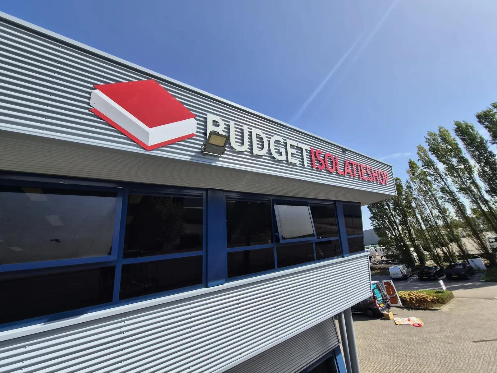
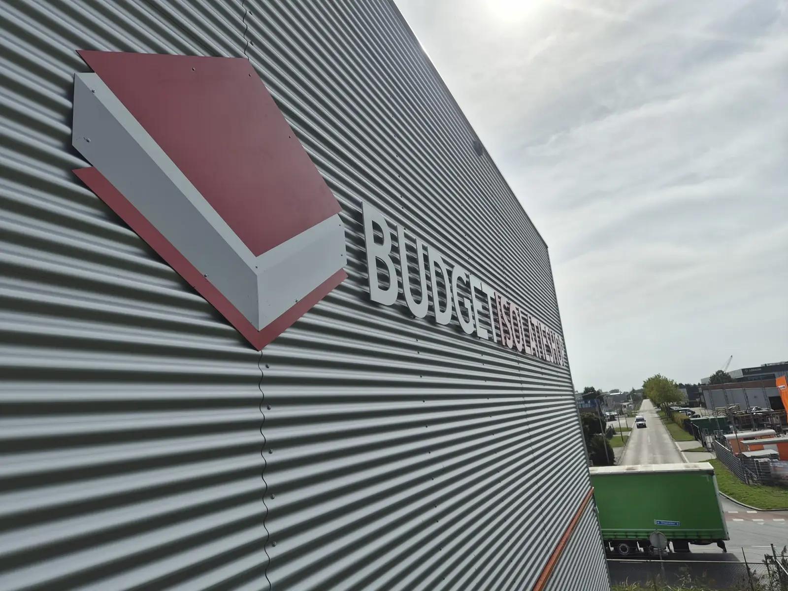
Acrylic façade letters and a cut-out logo give the Roosendaal building a distinctive identity.
For Budget Isolatieshop's new premises, BlinkOut combined acrylic letters with a printed sandwich-panel logo, mounted on stand-offs.
The story behind this project
Making a move visible from the outside
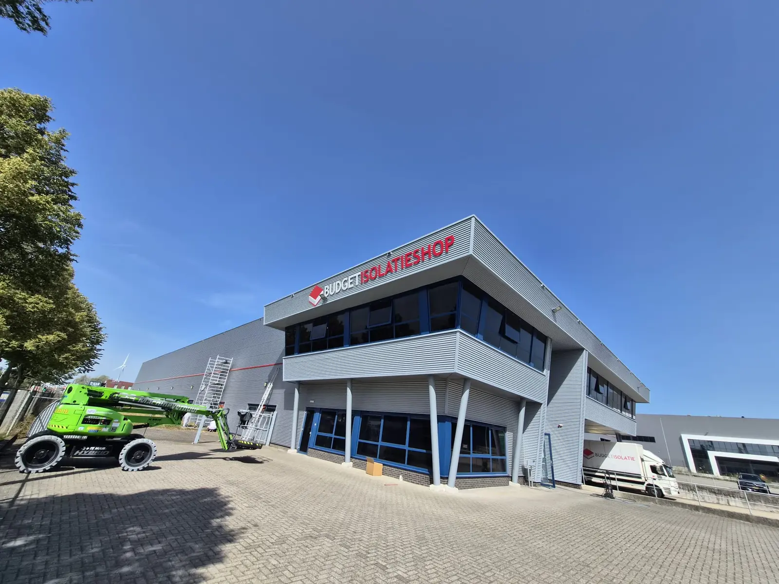
New premises offer an opportunity to put a business firmly on the map. Budget Isolatieshop wanted its name and logo on its new building in Roosendaal. The brief called for two large signs on the corners of the building, with advice on materials, dimensions and positioning. Working with a local partner was also a preference.
BlinkOut visited the site and developed the options. The chosen combination of individual acrylic letters and a cut-out logo complements the long horizontal lines of the cladding. Red and white bring the brand outside, with space between the letters allowing the façade to remain part of the composition.
Two materials, each with a purpose
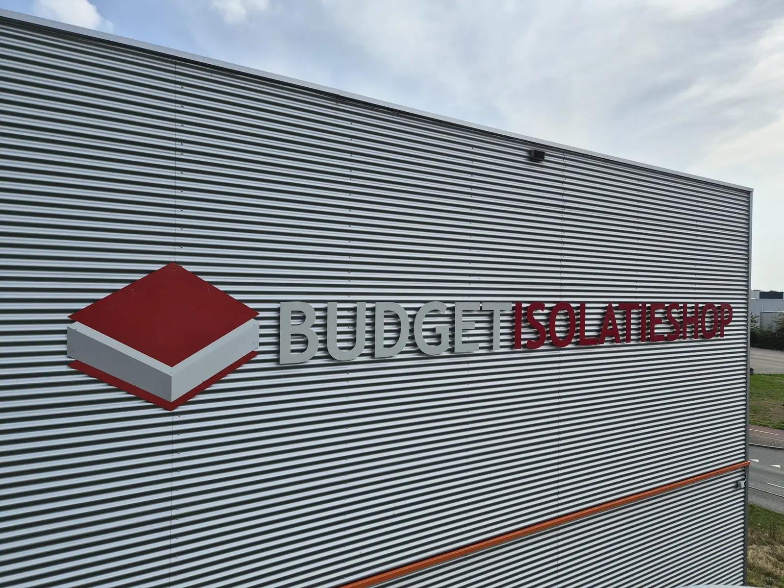
The lettering was specified in 8 mm acrylic with a gloss finish. This acrylic gives the letters visible material depth. The individual shapes have a more dimensional presence than a flat print applied to the façade.
The logo is made from 3 mm white sandwich panel, directly printed and finished with a gloss coating. This allows its colour blocks to be presented as a single cut-out shape. The combination uses acrylic's thickness for the name and a flat, printable substrate for the logo.
Stand-offs on profiled cladding
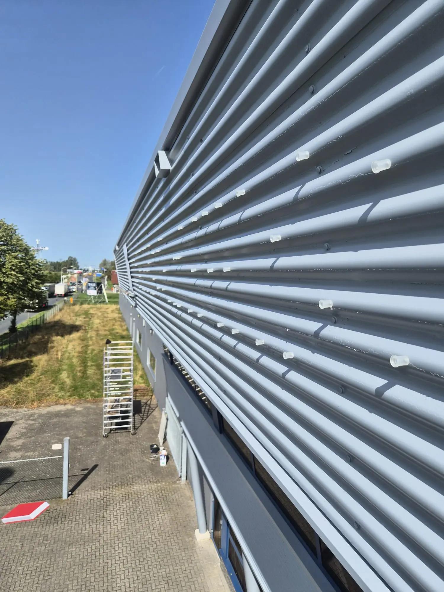
The metal cladding has a pronounced ribbed profile. The letters and logo are mounted on stand-offs, holding them away from the façade. The installation photograph shows the fixing points before the letters are fitted: a detail that largely disappears from view in the finished sign.
This spacing creates a subtle shadow around the shapes and makes their depth visible. Installation depends on accurate alignment and fixings suited to the substrate. The close-up photographs show how the logo, letters and cladding profile come together.
Turning a company name into a recognisable building
The two signs give the building the same identity from different viewing directions. The large logo and continuous company name show who is based here, while the individual letters leave the building's horizontal lines visible.
Moving premises or refreshing an existing façade? BlinkOut can develop a proposal for your letters and logos, from materials and artwork through to installation on site.
Your brand could be next
Ready to get your brand noticed?
Tell us what you have in mind. Taking inspiration from this project, we can help you find the right approach for your brand.