Outdoor signage
Uitvaartstichting Hilversum: clear routes in a peaceful setting
Calm, consistent wayfinding in a green setting
Directional signs, site maps and information boards in a consistent, understated style for Uitvaartstichting Hilversum.
The story behind this project
Clear directions where calm matters
At a cemetery, directions should feel straightforward. A recognisable entrance, an overview of the grounds and a clear arrow at the right junction all help visitors find their way. For Uitvaartstichting Hilversum, we supplied wayfinding and information boards that bring these functions together.
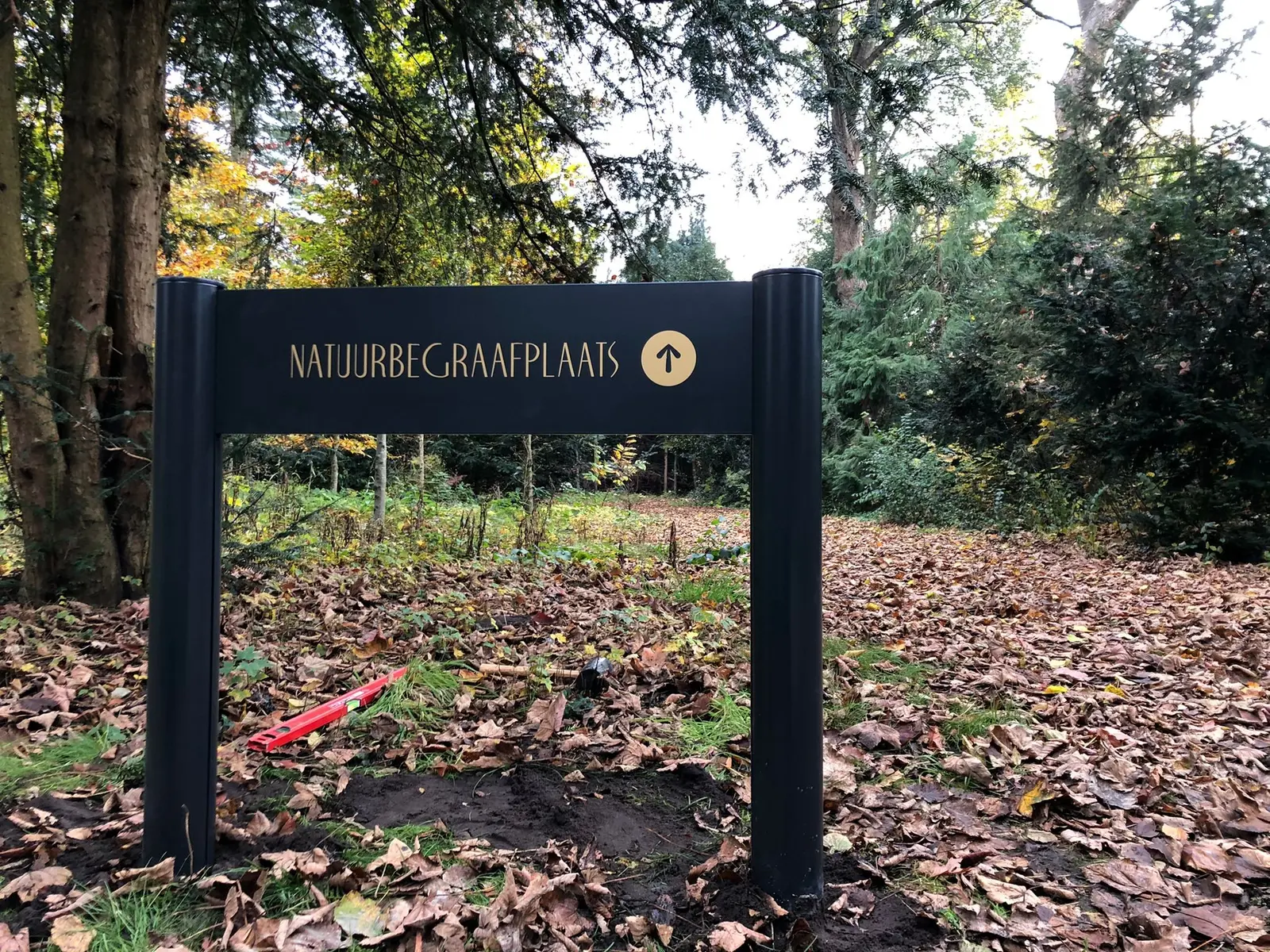
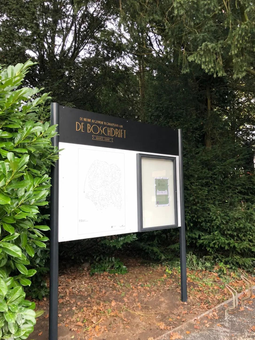
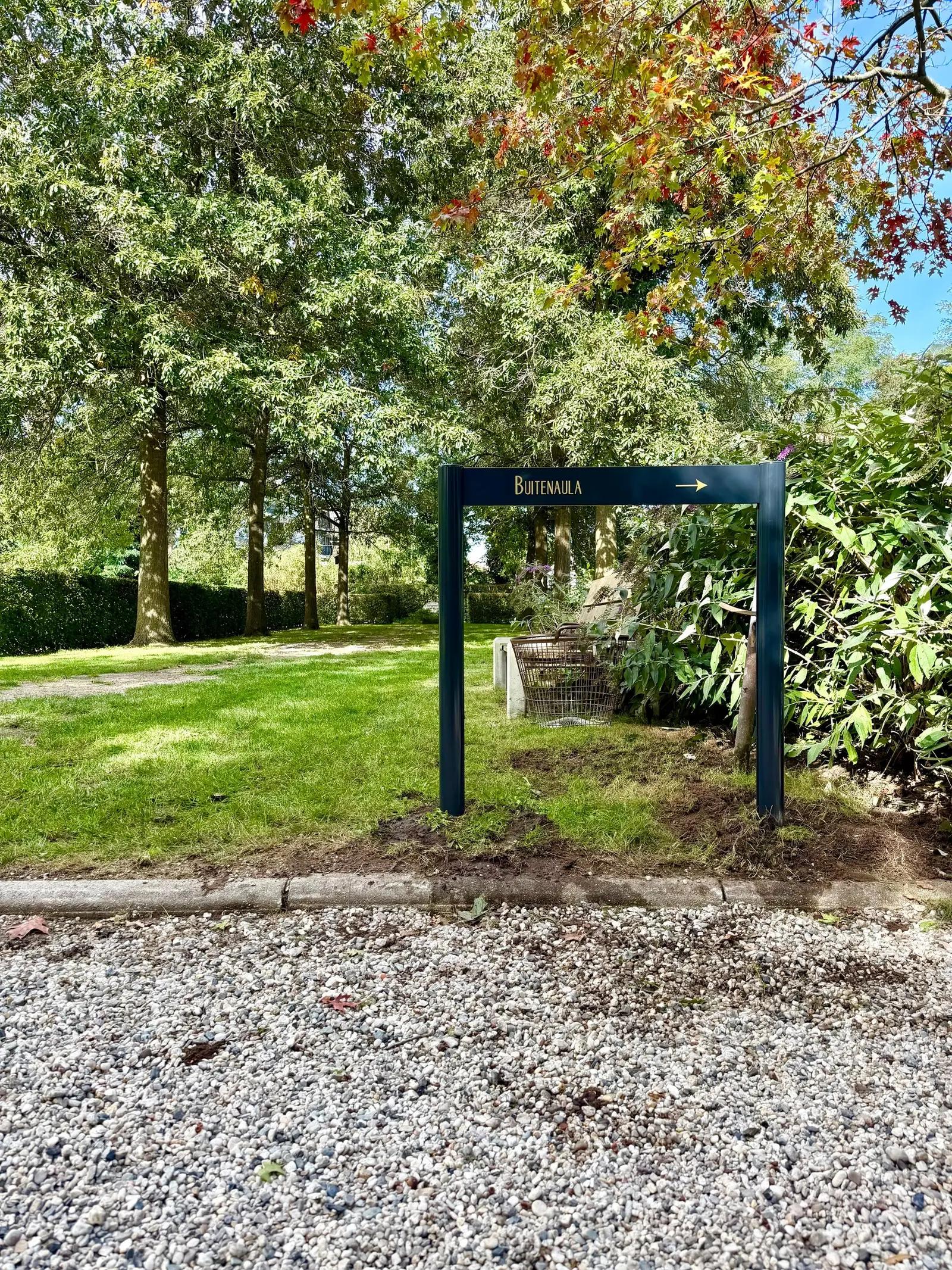
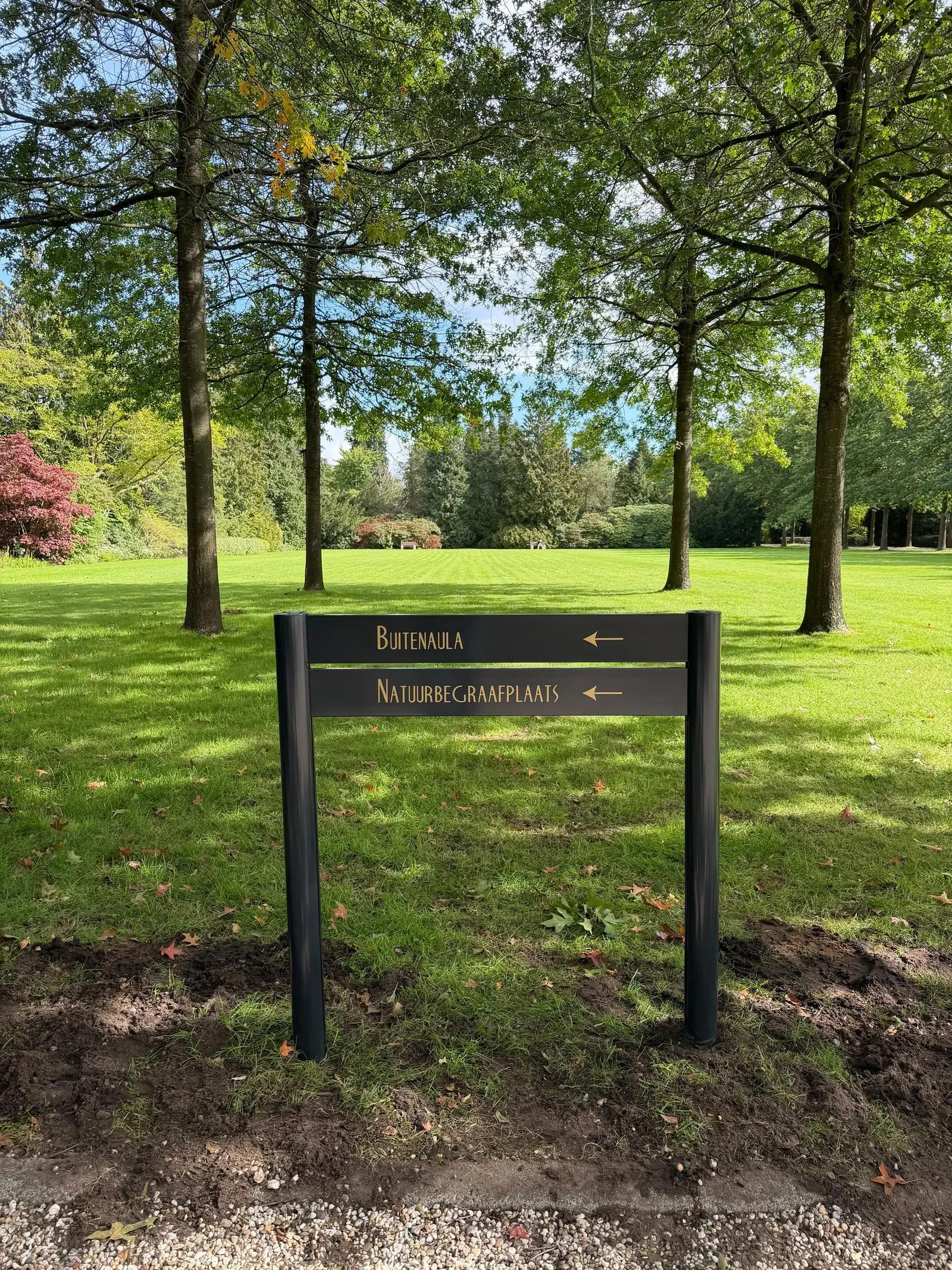
From the information boards at De Bosdrift to directional signs among the trees, dark supports and gold-coloured lettering create a consistent appearance that sits comfortably within the surroundings.
From the site map to the next turning
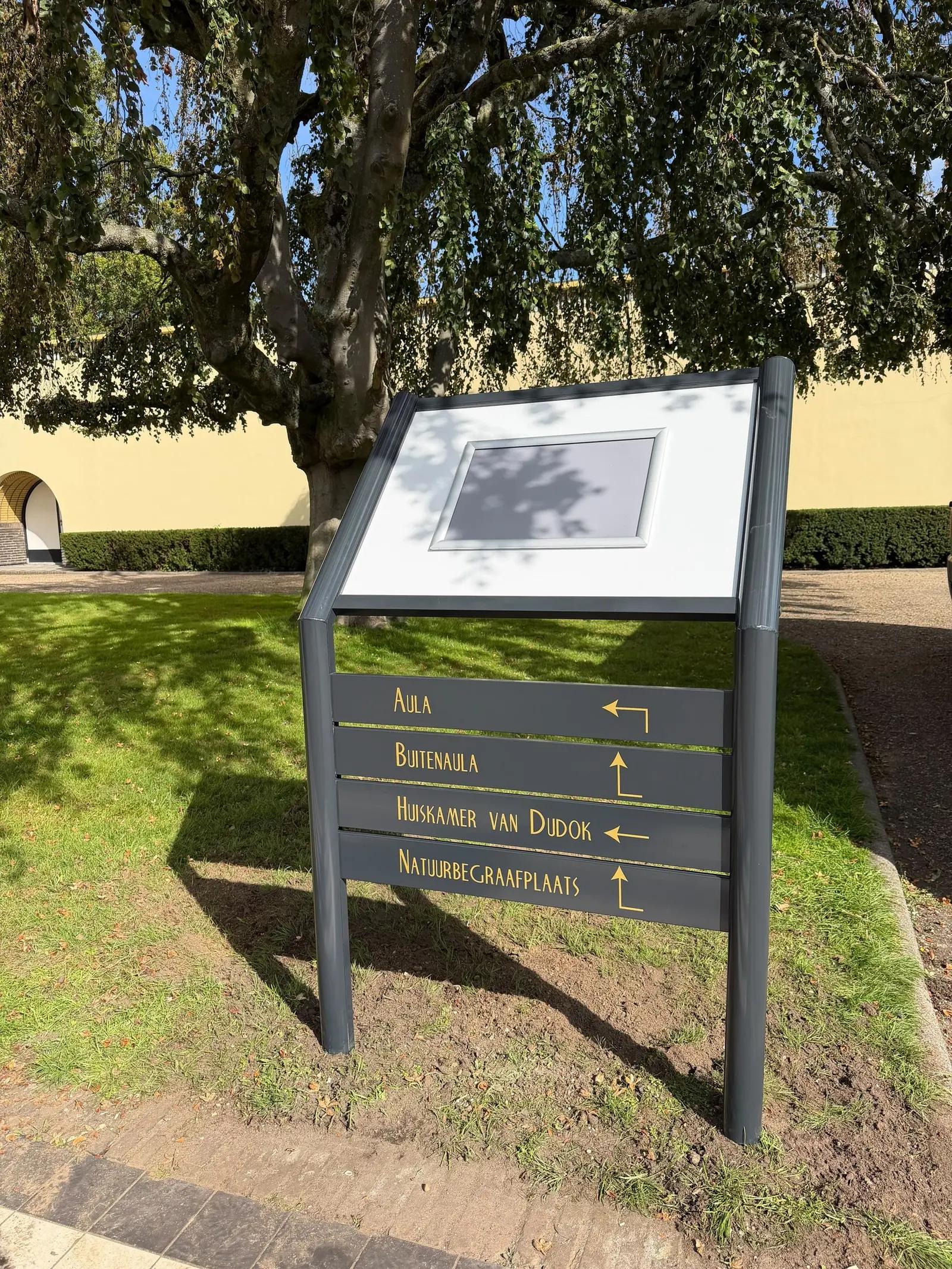
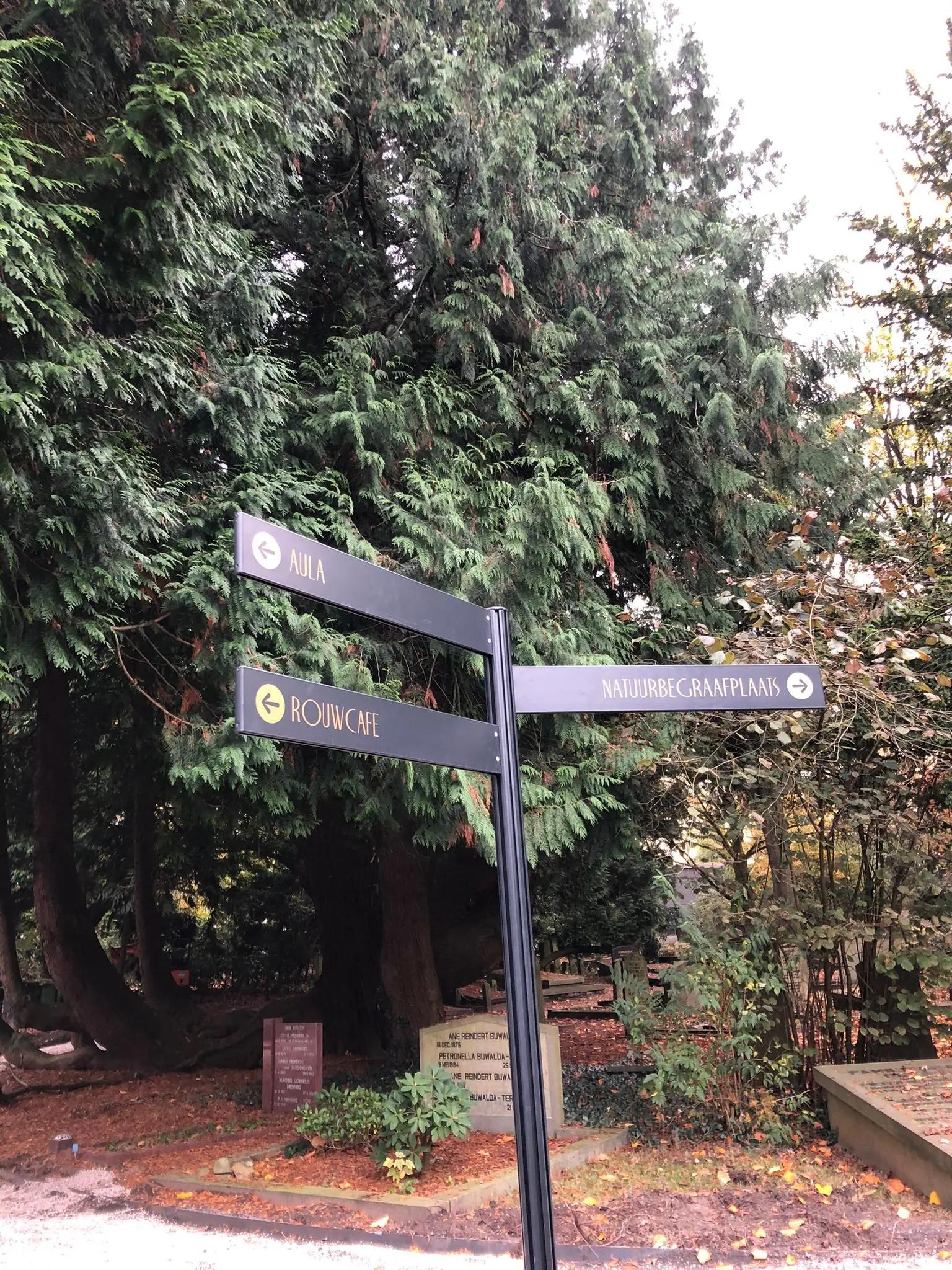
Each sign has its own purpose. A site map provides an overview on arrival. Fingerpost signs show several destinations at a junction, while lower signs confirm the route towards places such as the natural burial ground. The format reflects the information needed at that point.
During preparation, we discussed the wording, arrow directions and letterforms. At De Bosdrift, we worked with the client to find a suitable alternative when parts of the initially requested typeface proved too fine for cut-vinyl lettering. The approved lettering balances the desired appearance with practical production requirements.
Signs that work together
Effective wayfinding combines the sign structure, lettering and position. Several directional panels on one post keep junctions organised; an information board provides room for a map and more detailed guidance. Repeating colours and typography helps visitors recognise the signs as parts of the same route.
Consistency also depends on the details: space around the wording, a recognisable arrow and a panel size suited to its content. Compact directional signs and larger information boards complement one another along the visitor route.
Wayfinding suited to your site
A site needs more than a collection of individual signs. BlinkOut helps you consider the information visitors need, the appearance and the right execution. Would you like to welcome visitors and guide them more clearly? Contact us to discuss wayfinding for your location.
Your brand could be next
Ready to get your brand noticed?
Tell us what you have in mind. Taking inspiration from this project, we can help you find the right approach for your brand.