Outdoor signage
De Baayaert: a recognisable welcome in Wouw
Built-up letters, façade panels and window graphics for the new school and childcare building.
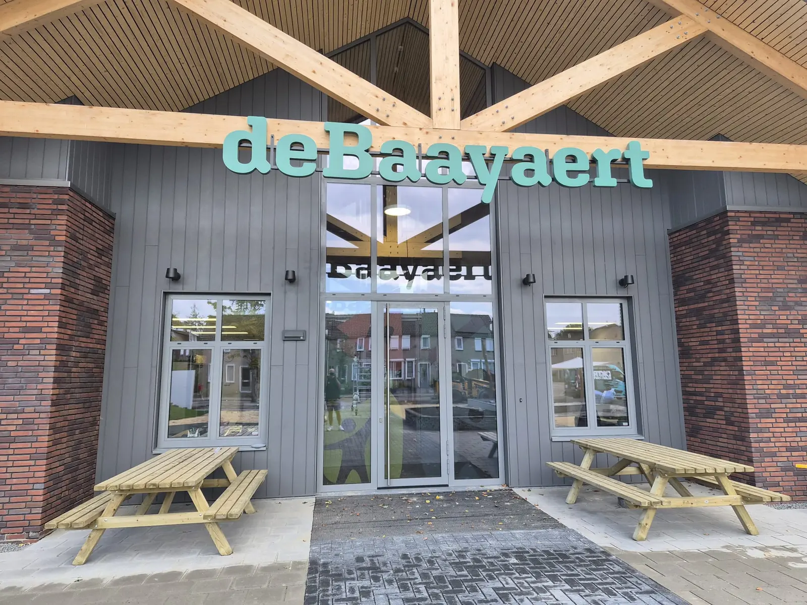
A welcoming entrance for De Baayaert in Wouw, combining aluminium built-up letters, colourful façade panels and printed window film in a consistent visual identity.
The story behind this project
A new building with a familiar name
For De Baayaert school and childcare centre in Wouw, we developed the signage for its new building. The brief went beyond a name above the door: the entrance, façade and windows needed to express the centre’s identity together. Recognisable colours and clear messages give the building its own character for children, parents and visitors.
The design developed through discussion. We adjusted the proportions of the façade panels and removed an additional logo above the entrance. The colourful window graphics already provide plenty of character there. This gives each element room and keeps the entrance visually balanced.
Aluminium letters with real depth
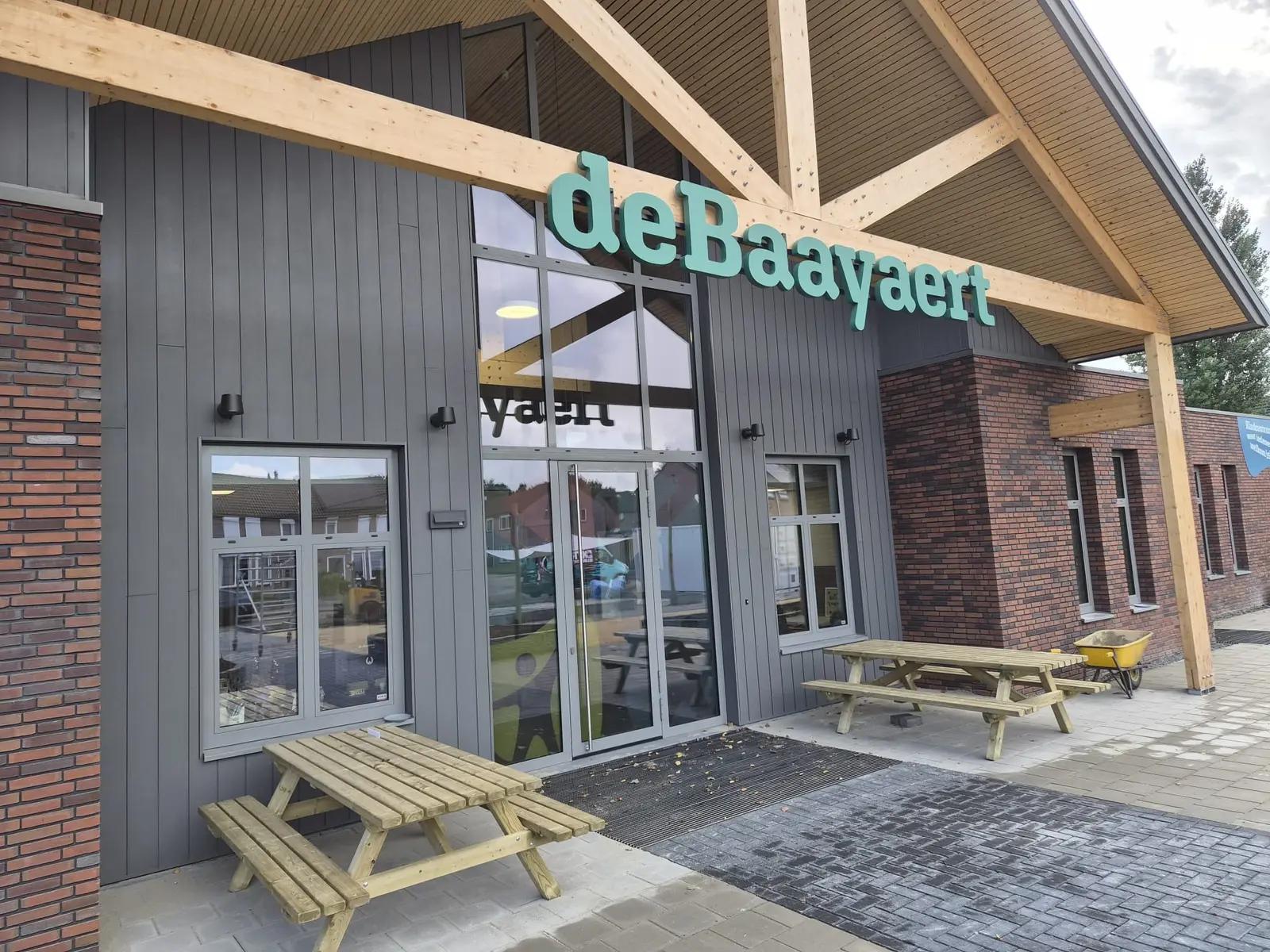
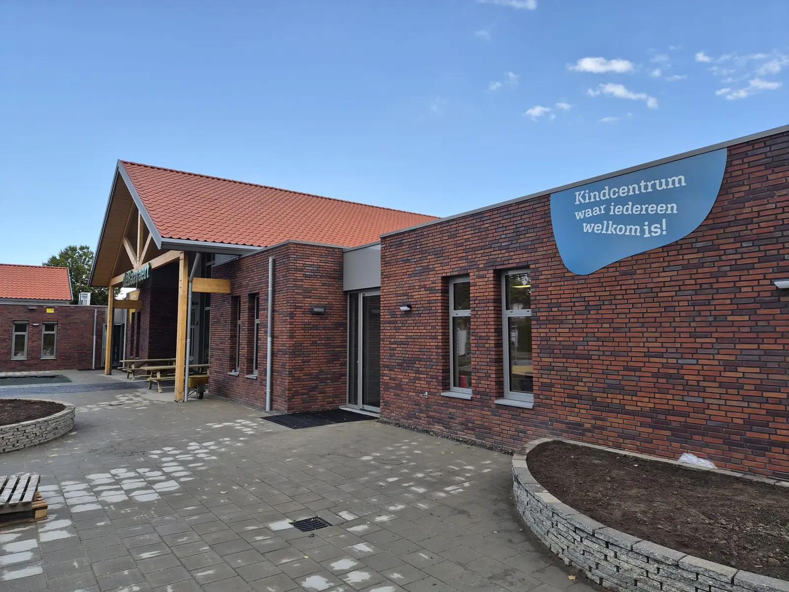
The name above the main entrance uses non-illuminated aluminium built-up letters. The specified construction is 50 millimetres deep, with a PVC backing and a two-component paint finish. Their three-dimensional shape creates visible edges and shadows, lifting the name away from its background.
An aluminium frame supports the letters at the timber beam structure, keeping the individual characters aligned as a complete sign. The green colour reflects the visual identity and stands out against the timber and dark cladding. It creates a recognisable focal point that works with the architecture.
Carrying the identity onto the glass
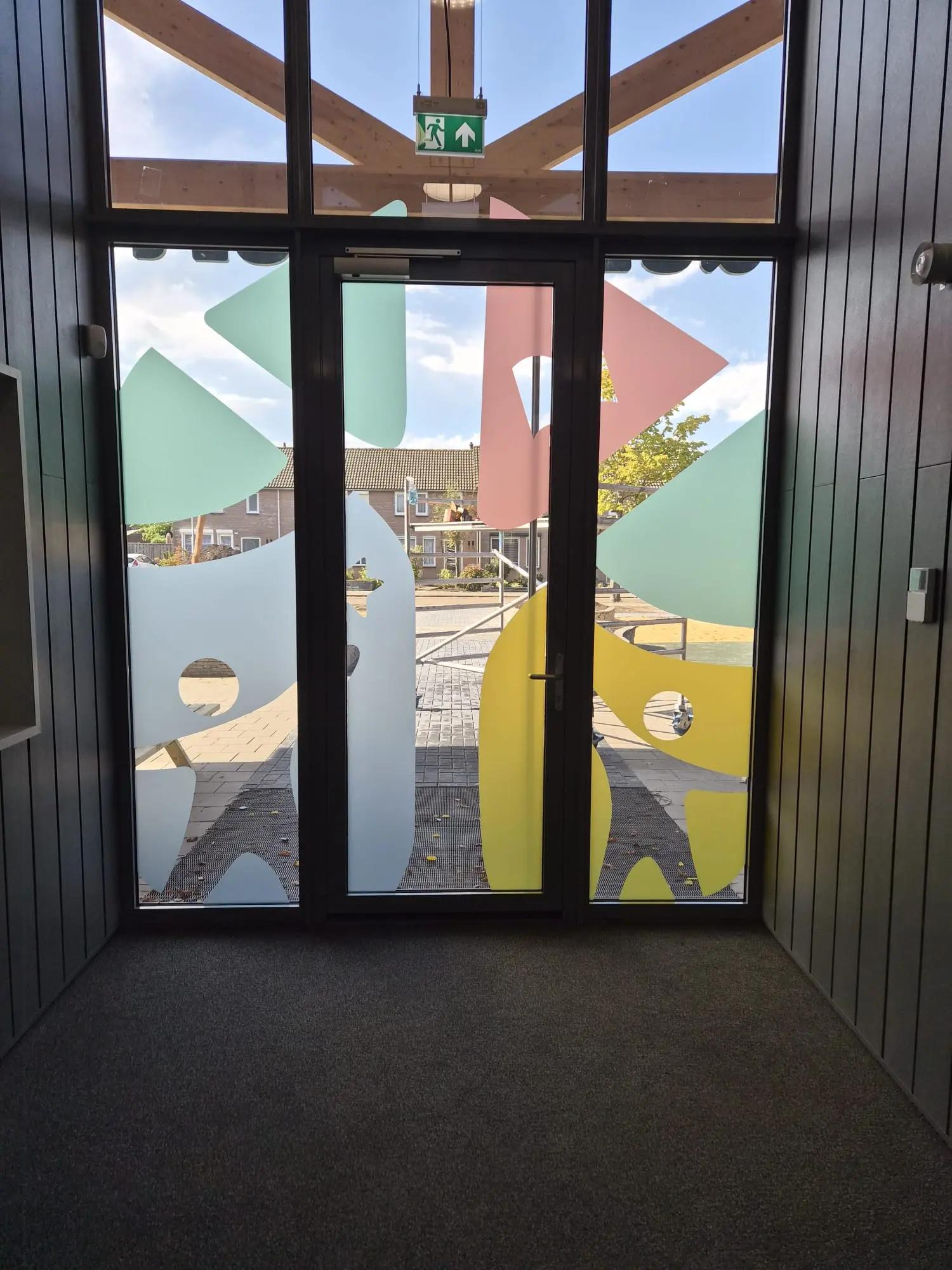
The glazed entrance is part of the design too. Printed frosted window film brings De Baayaert’s playful shapes and colours onto the door and sidelights. The film has a matt, sandblasted appearance, while the uncovered areas retain views through the glass.
Considering the window graphics and building name together creates a consistent experience, from the first view of the building to stepping inside. The supplied brand colour reference informed the final colour coordination.
A message that belongs to the place
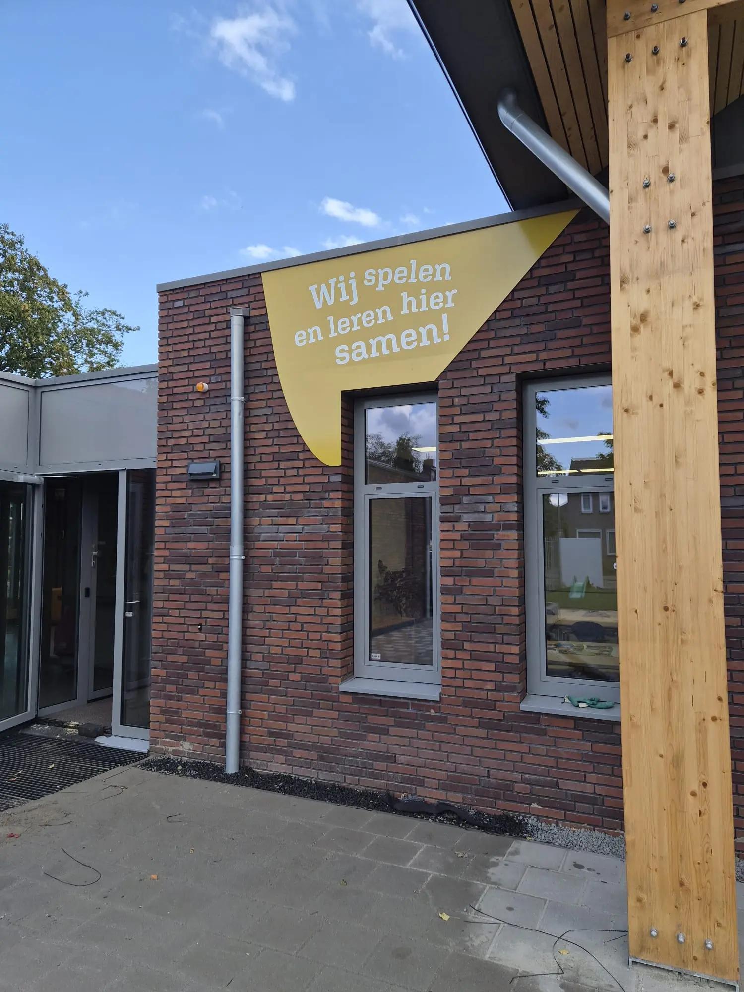
Colourful panels on either side of the entrance complete the scheme. Their shapes follow the visual identity and are finished with full-colour vinyl. Messages about playing, learning and being welcome give the building an approachable character.
This combination shows how signage can help a school or childcare centre: making its name recognisable while expressing the organisation’s atmosphere outside. Want to give your building a distinct identity? BlinkOut can help with a coordinated design, suitable construction and installation.
Your brand could be next
Ready to get your brand noticed?
Tell us what you have in mind. Taking inspiration from this project, we can help you find the right approach for your brand.