Outdoor signage
Electra: charging stations in a recognisable brand style
A recognisable identity for charging stations across the Netherlands
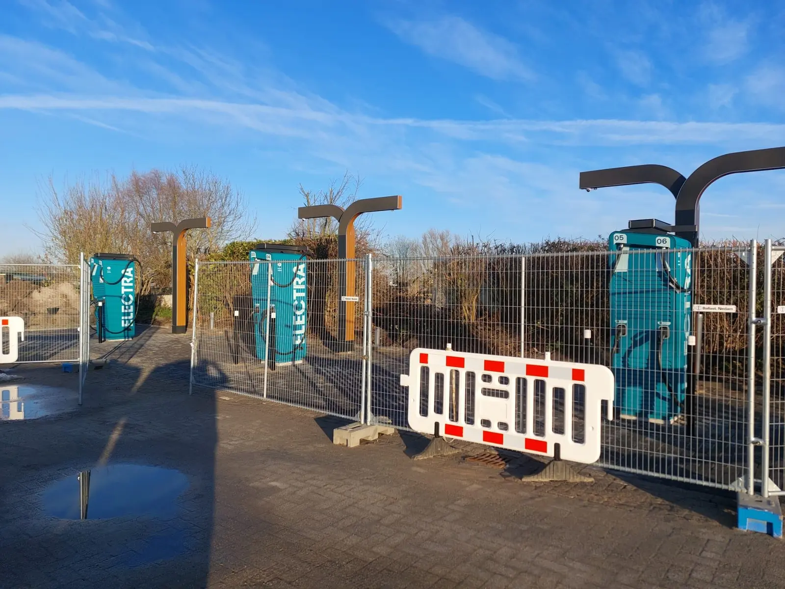
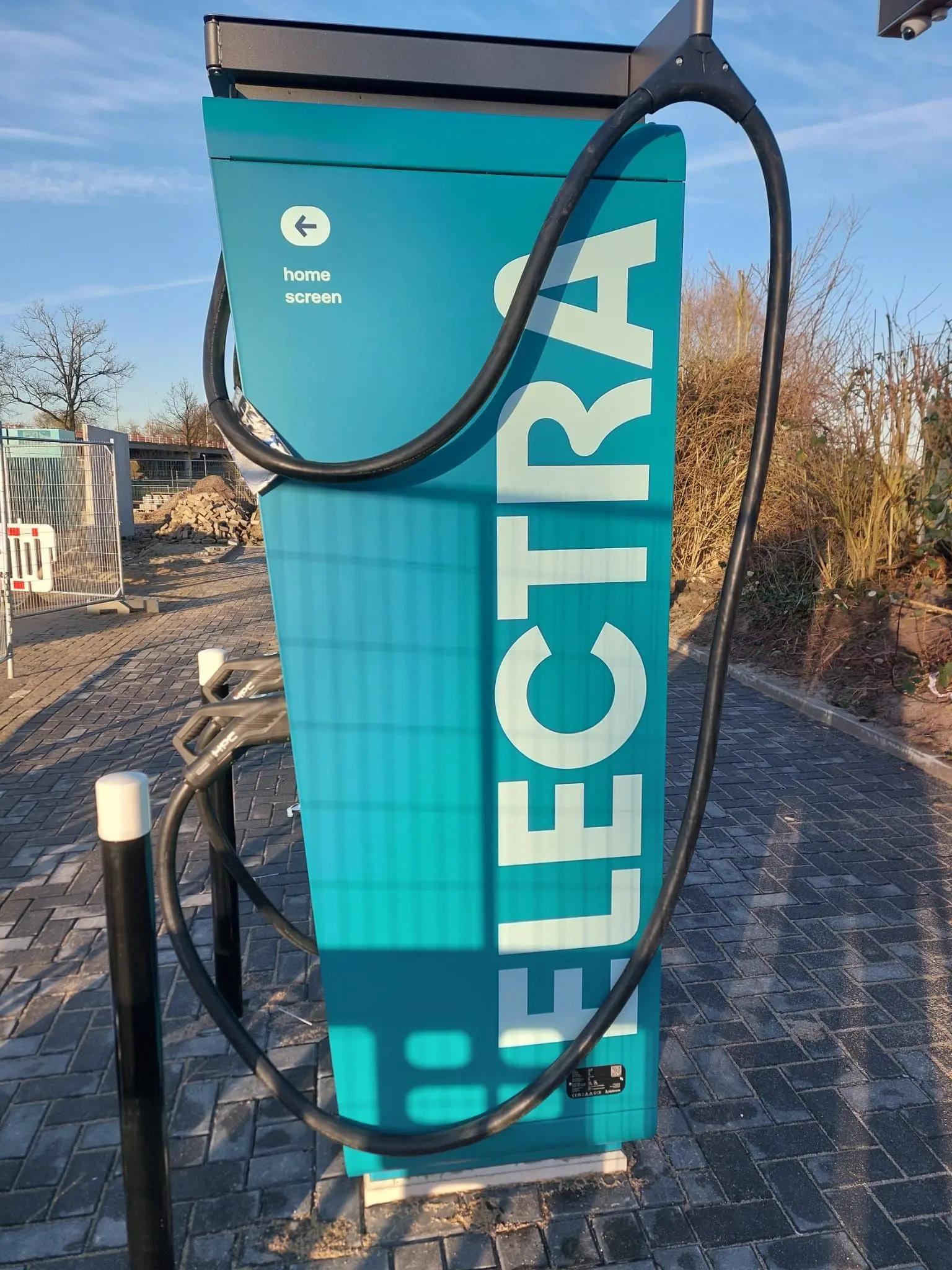
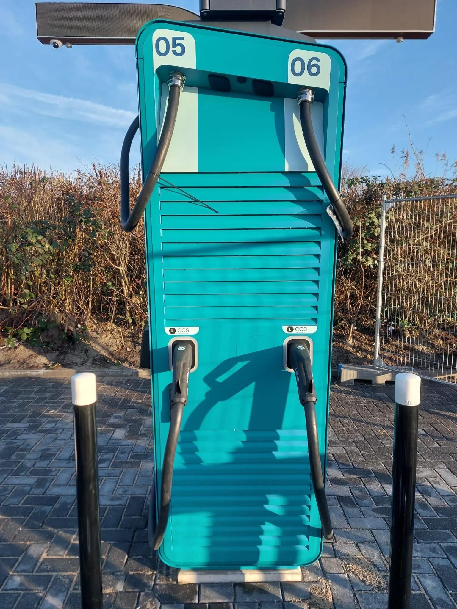
Matte charger graphics, prominent Electra logos and location-specific charging-point information bring a consistent identity to Dutch charging sites.
The story behind this project
A consistent identity across charging sites
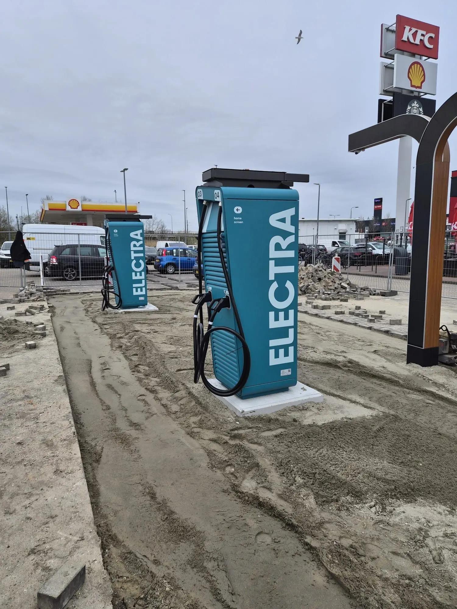
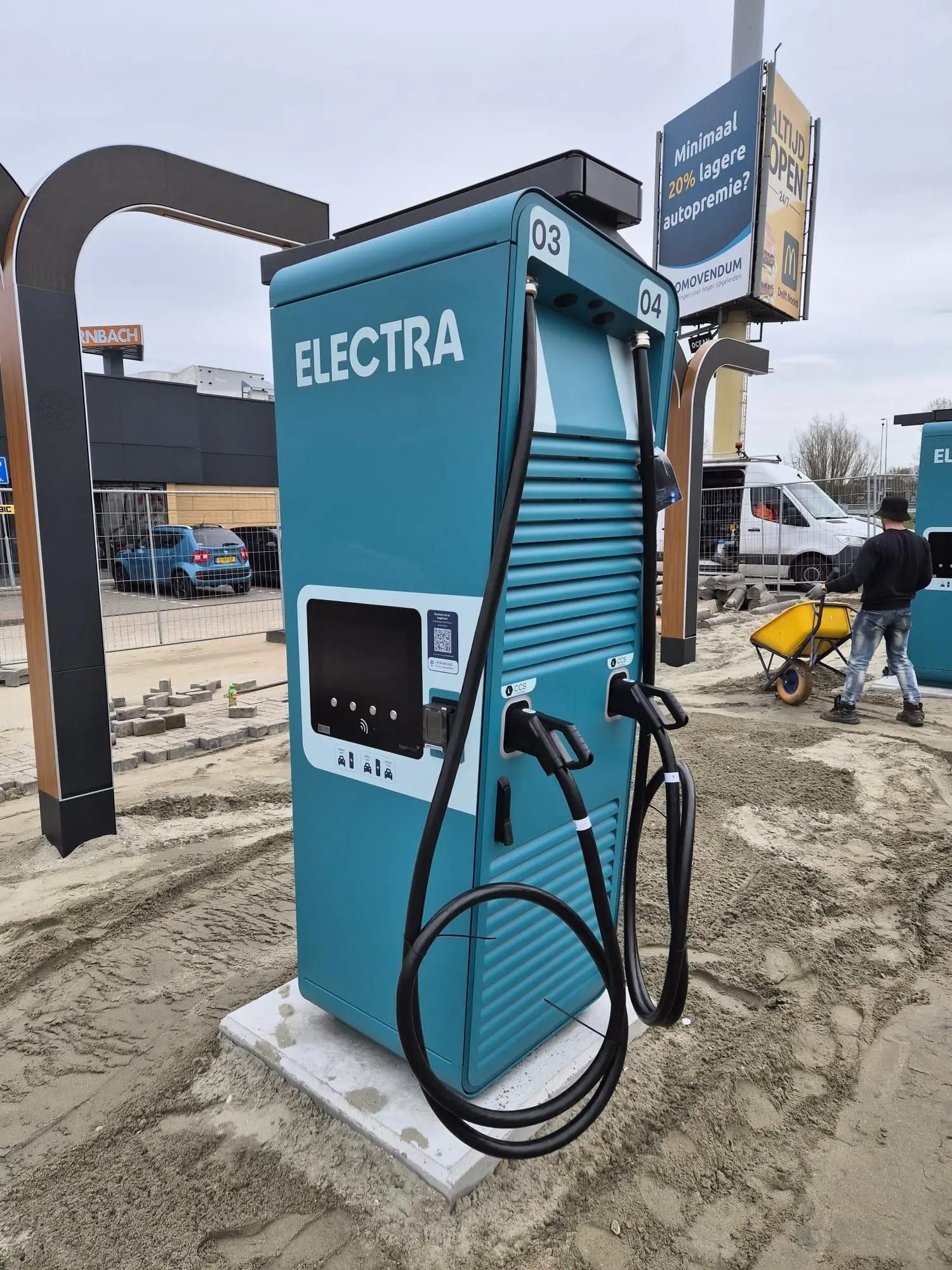
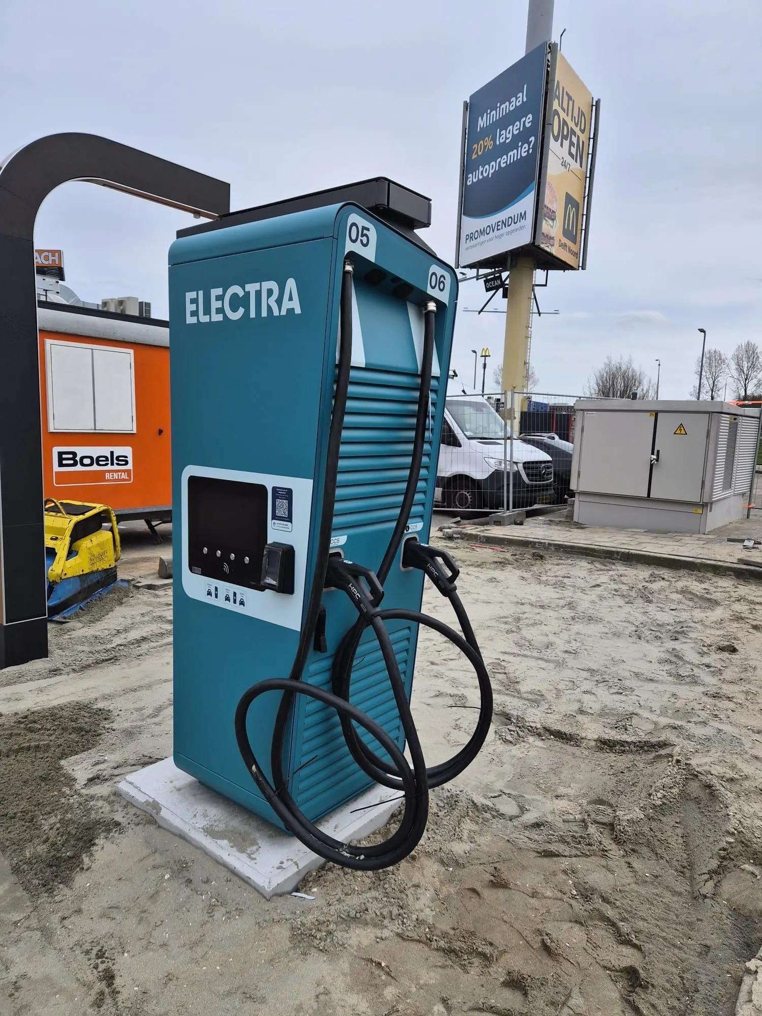
For Electra, BlinkOut supplied graphics for charging stations at several locations in the Netherlands. The distinctive turquoise colour and white name make the housings recognisable. The brief extended beyond branding: charging-point numbers and QR codes also needed the correct position in each site’s design.
The photographs show the graphics from several angles, including the application at KFC in Rijswijk. The surrounding site was still being prepared. These images show signage on the housings, rather than the commissioning of the complete charging location.
Branding and practical information
A charging station is viewed from the approach road and at close range when connecting a vehicle. Large logos support recognition at a distance. Information beside the controls requires an uncluttered layout and a clear connection to the relevant charging point.
For Rijswijk, the supplied QR codes were incorporated into the artwork and submitted for approval. Station layout, connector numbering and the supplied codes therefore form part of the preparation for each location. A consistent identity is combined with information that varies between charging points.
Matte film matched to the housing
A matte finish was agreed for the project series. Production correspondence specifies film with a strong adhesive layer combined with a matte laminate. This matters on housings with different shapes and surface textures: the print needs a suitable application approach as well as a clear visual result.
The substrate, edges and profiles determine how each graphic panel is prepared and installed. The laminate provides a finishing layer over the print. Its matte appearance reduces gloss within the design, while colour, logos and information form a coordinated surface.
A repeatable identity, adapted to each site
Recognition comes from repeating the same colour and visual style across a charging environment. Each installation nevertheless needs its own checks: the housing, station position and local numbering all matter. Artwork, approved proofs and installation must therefore work together.
Looking to brand equipment, charging stations or a series of outdoor objects? BlinkOut can help translate the design onto the available surfaces and coordinate the branding with the function and conditions of each location.
Your brand could be next
Ready to get your brand noticed?
Tell us what you have in mind. Taking inspiration from this project, we can help you find the right approach for your brand.