Outdoor signage
Rynart Logistics: a recognisable name on the warehouse
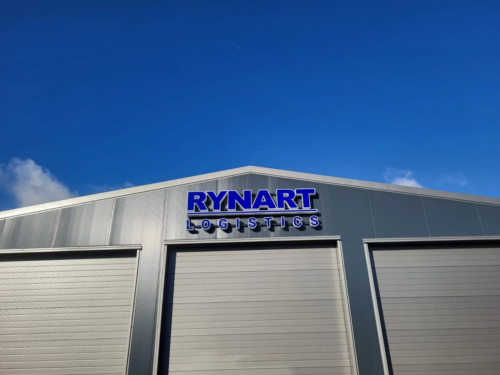
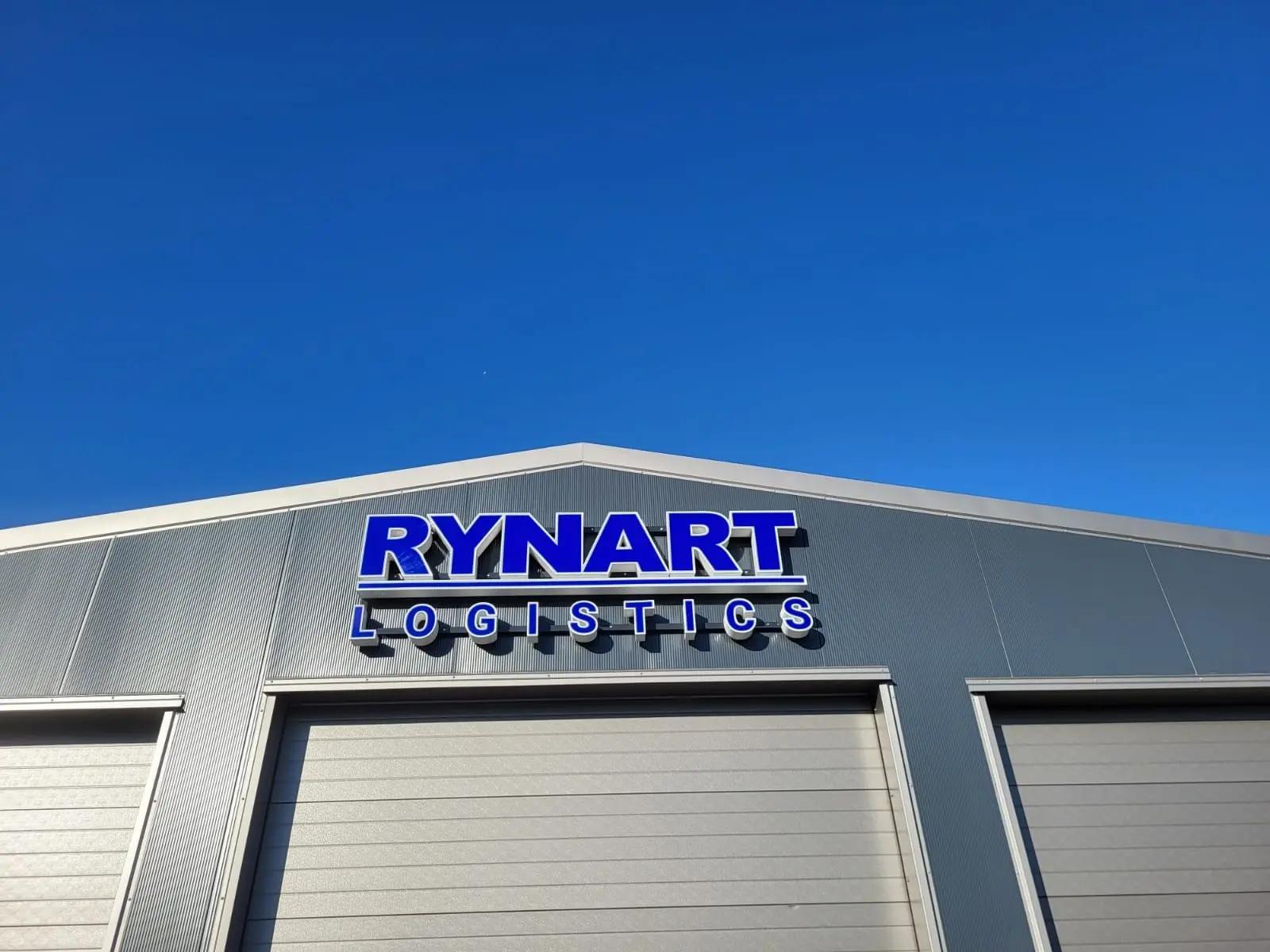
A blue and white logo above the central warehouse door
Dimensional Rynart Logistics fascia letters identify the warehouse in Zevenbergen, with care for proportions and positioning.
The story behind this project
A recognisable name on the warehouse
For its warehouse in Zevenbergen, Rynart Logistics wanted the company logo above the central door. The brief was specific: blue Rynart lettering with a white border, with Logistics beneath it in the right proportions.
BlinkOut developed an artwork proof using the building drawing. Positioning the name above the central warehouse door gives it a clear reference point on the facade. The logo stands against the light panels, with the letter construction adding a dimensional appearance.
Balancing the main name and supporting line
The supporting line was an important part of the design. During the artwork discussion, the client asked for Logistics to remain below Rynart and for the main name to move slightly higher. This preserved the intended relationship between the two lines.
After the quotation was approved, measuring the site and confirming the position were discussed too. A drawing provides the starting point; the actual facade and available space determine where the letters work best.
How a channel letter is constructed
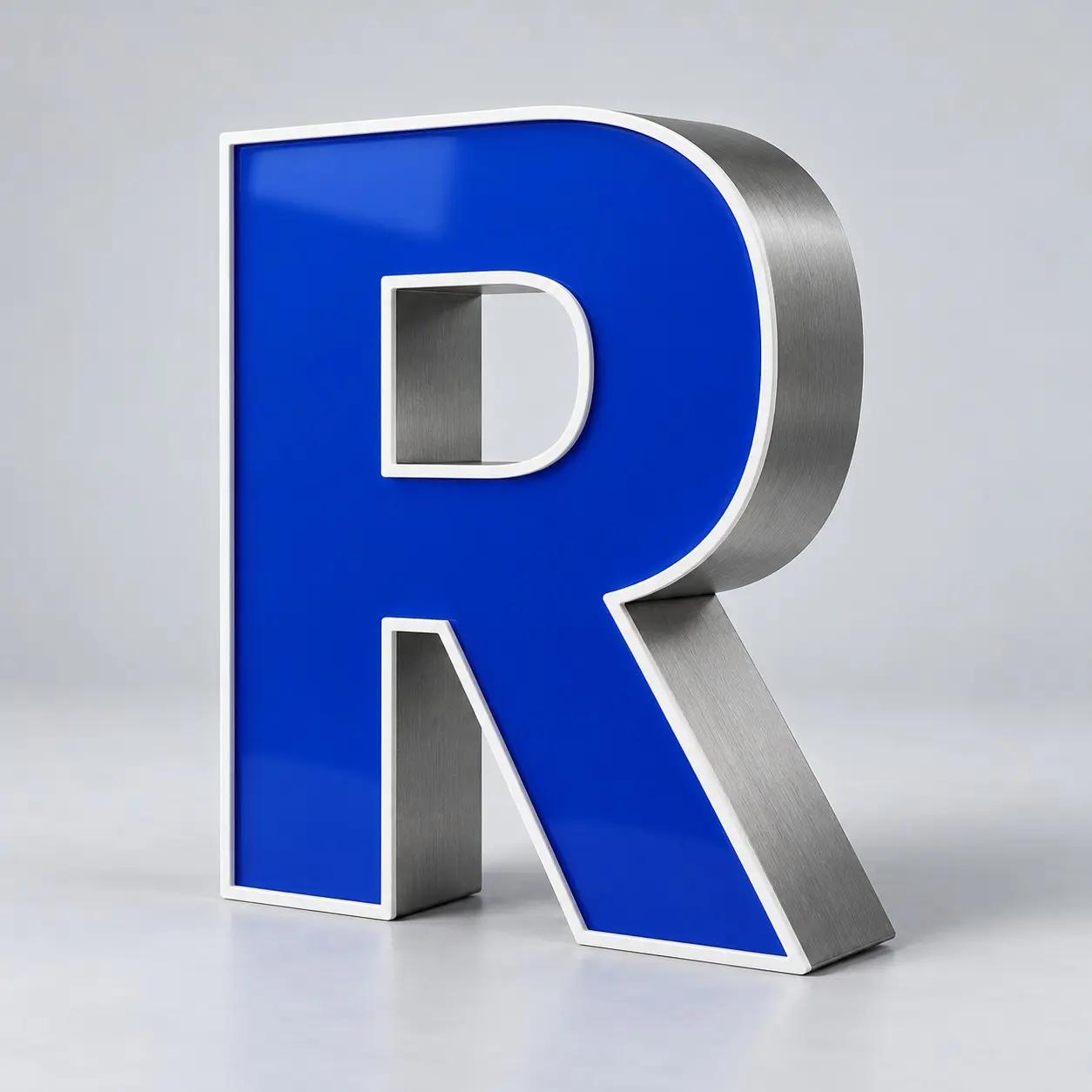
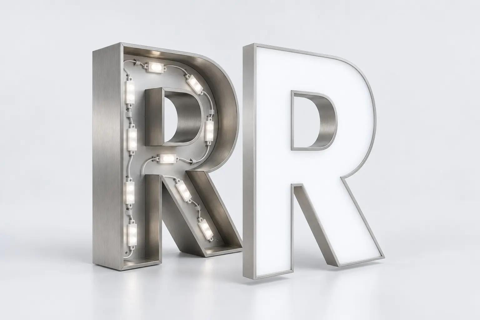
A channel letter consists of a casing, returns and a face. This construction gives a logo depth. An aluminium casing, for example, provides a rigid base, while a translucent acrylic face determines its colour and illuminated appearance. The trim holds the face in position and defines its outline.
In front-lit channel letters, LED modules sit inside the casing and shine towards the face. Light then passes through the acrylic. The position of the modules and the space behind the face are planned around the letter’s shape. The open 3D view explains this general construction; the blue letter shows how the face, trim and returns form a dimensional whole.
A clear reference point on the building
The two lines form a recognisable logo above the warehouse door. Blue faces and white borders keep the name clear, while the letter depth brings the logo away from the facade.
Would you like fascia lettering for a warehouse or business premises? BlinkOut can help with logo artwork, size, illumination and installation on your facade.
Your brand could be next
Ready to get your brand noticed?
Tell us what you have in mind. Taking inspiration from this project, we can help you find the right approach for your brand.