Interior decoration
VanThuisUit: a recognisable welcome from exterior to doorway
A distinctive entrance in Sint Willebrord
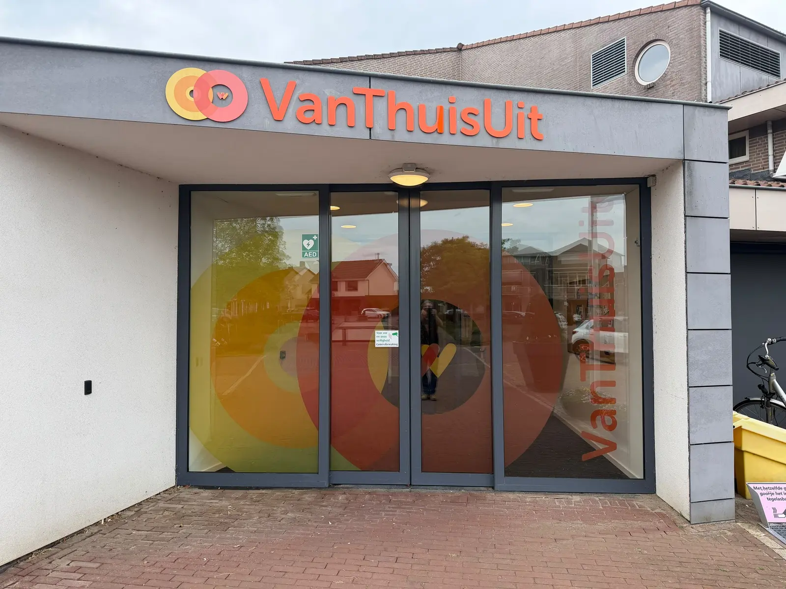
Acrylic lettering and printed window film give VanThuisUit a distinctive entrance and carry its visual identity through to the interior.
The story behind this project
Making the right entrance easy to recognise
The brief for VanThuisUit's new location in Sint Willebrord was specific: make the front door and the connecting door to Heidestede recognisable. A distinct visual identity would help visitors tell the VanThuisUit entrance apart from Heidestede's.
BlinkOut translated the supplied logo into a combination of acrylic façade lettering and printed window film. Warm colours and overlapping circles appear in several places. Recognition starts outside and continues through to the internal door.
Acrylic brings depth to the logo
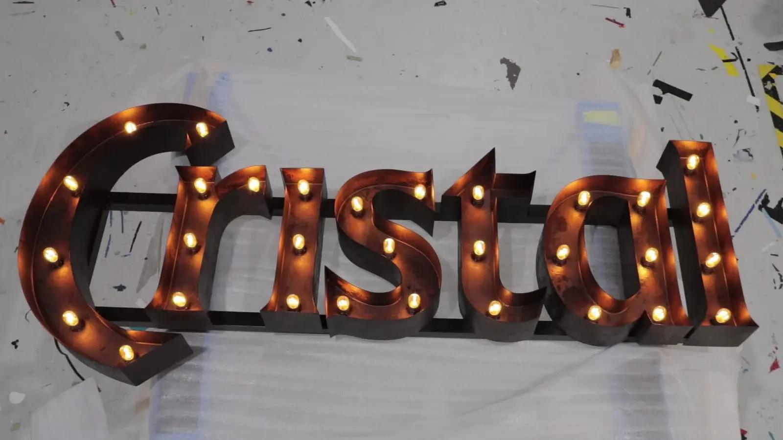
Above the entrance, the name and logo are applied as separate acrylic elements. Acrylic sheet can be shaped into letters and logo forms. Its visible thickness gives the lettering a dimensional appearance, while the façade remains visible between the individual shapes.
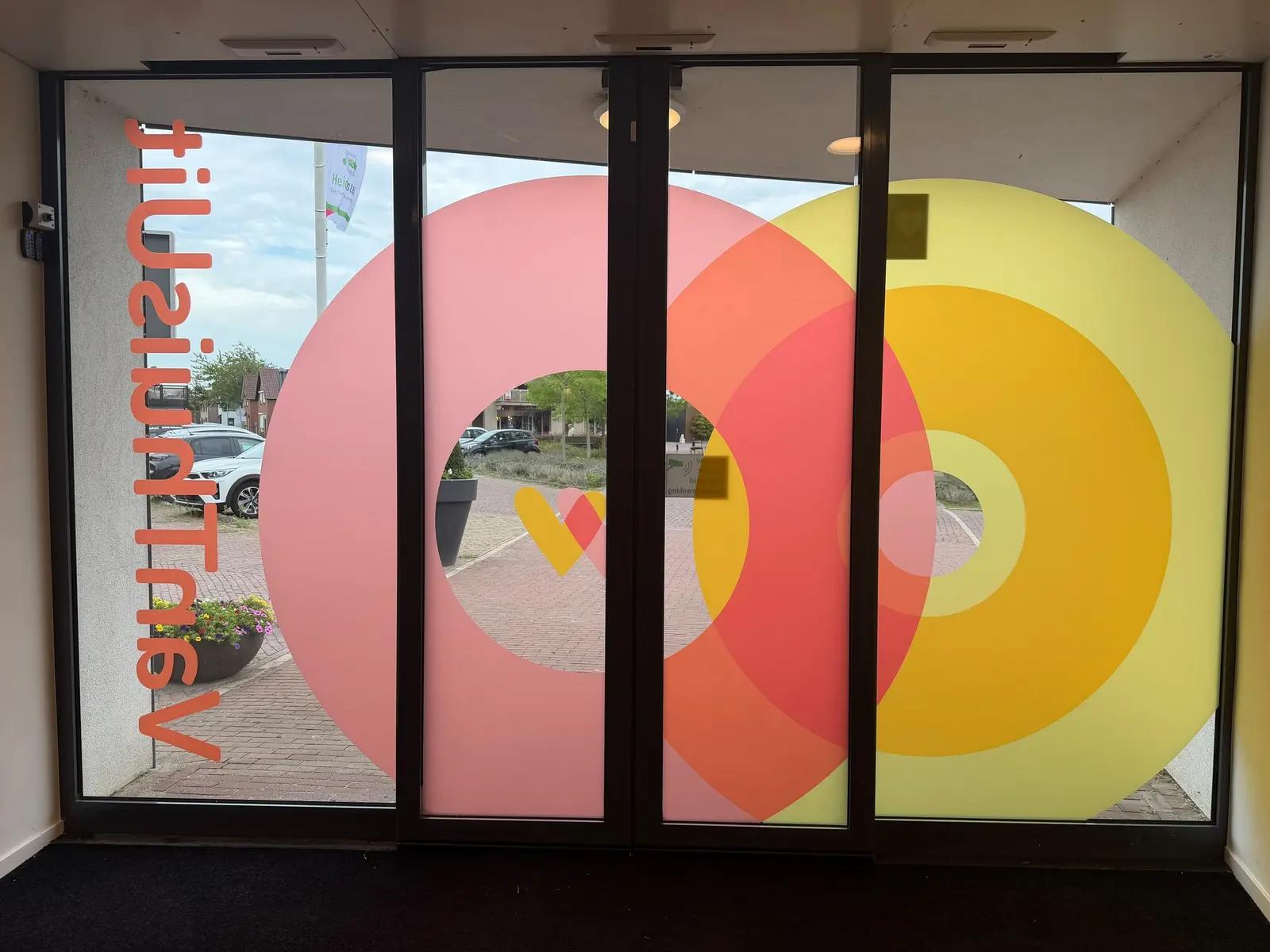
Here, this gives the name a clear position above the glazed entrance. The same colours and forms reappear on the glass below at a larger scale. The façade lettering and window graphics support one another, distributing the visual identity across the entrance.
Window film connects outside and inside
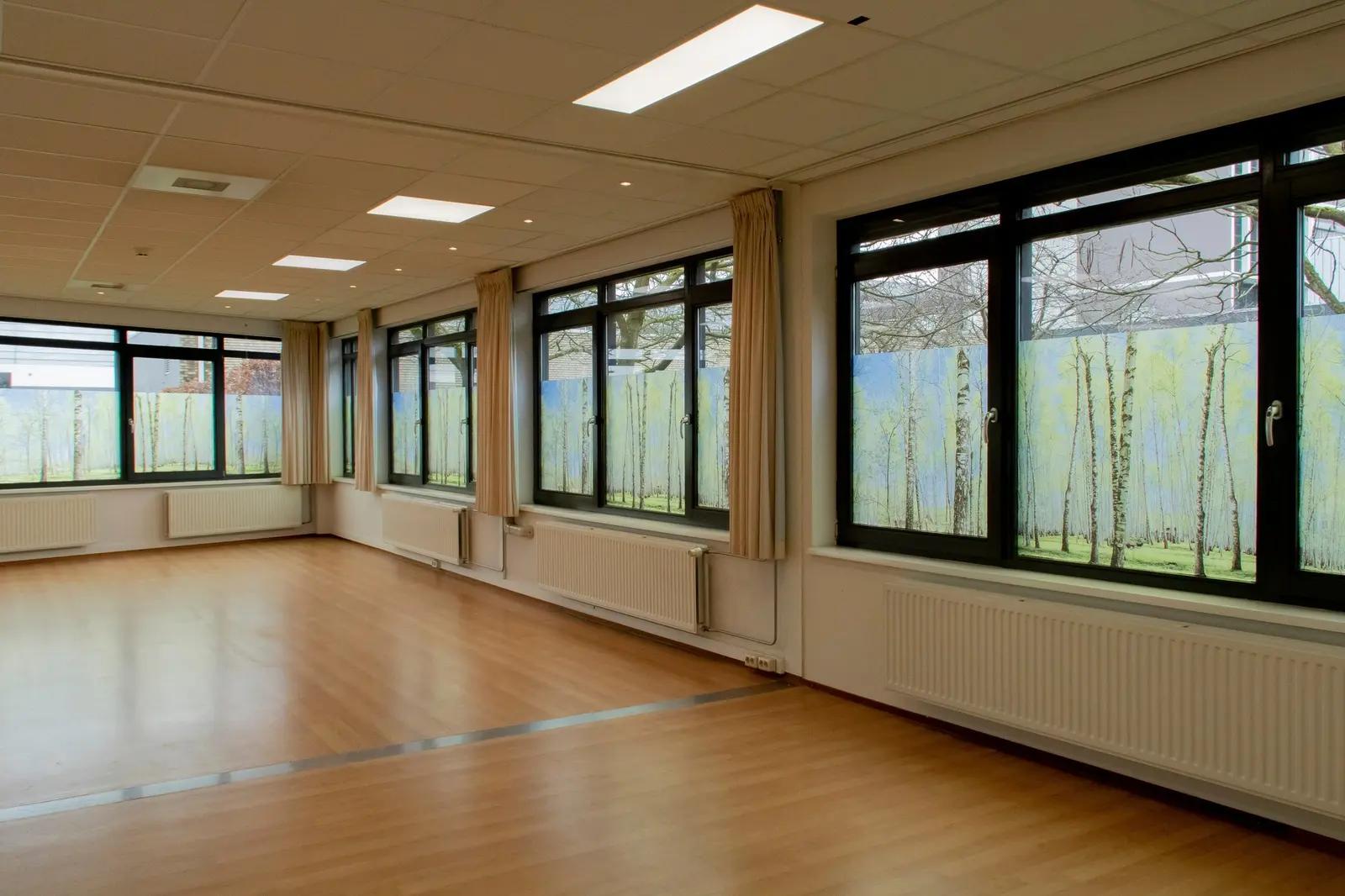
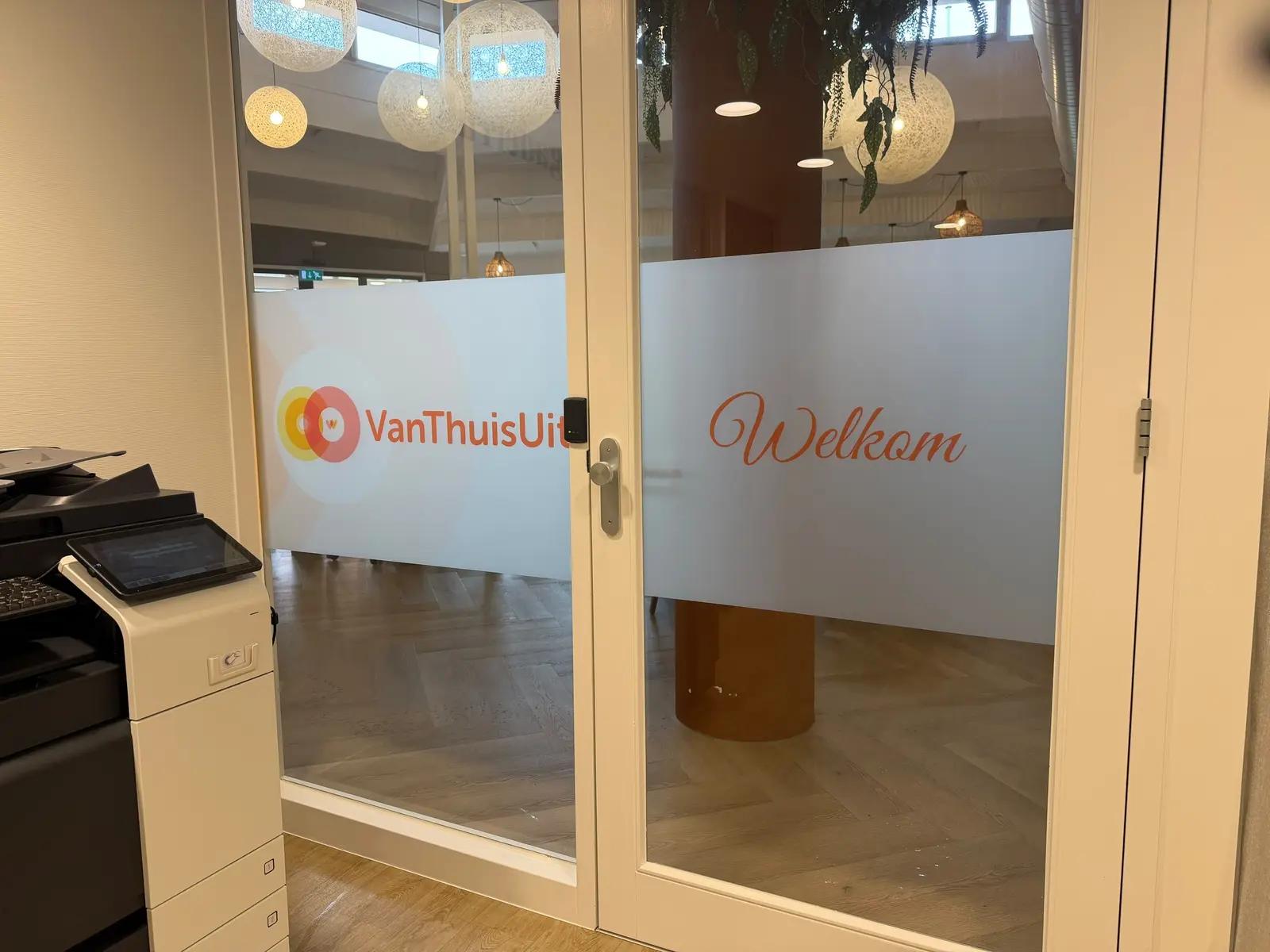
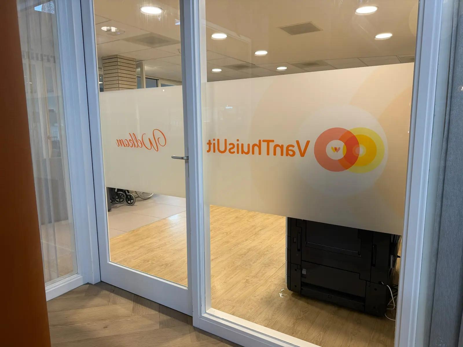
Large printed circles create a distinctive feature on the front door. On the connecting door, the identity takes a quieter form: a broad frosted band carrying the logo and a welcome message. Uncovered areas of glass retain views into the adjoining space.
Window film adds colour, lettering and a frosted appearance to existing glazing. It allows you to choose which areas to highlight or screen. At VanThuisUit, that choice is visible in the colourful entrance door and the more understated internal band. Before production, we agreed the design with the client using the supplied vector logo and an approved concept.
One identity from façade to internal door
The result brings the name, colours and welcome together at the points where visitors arrive. Would you like an entrance that makes your organisation recognisable? BlinkOut can help with façade lettering, window film and a coordinated interior. Contact us to explore the options for your location.
Your brand could be next
Ready to get your brand noticed?
Tell us what you have in mind. Taking inspiration from this project, we can help you find the right approach for your brand.