Outdoor signage
Vrouwenhof Roosendaal — wayfinding in a green setting
A recognisable entrance, clear directions and useful visitor information.
Entrance signs, a directional signpost and window information bring the Vrouwenhof identity together along a clear visitor route.
The story behind this project
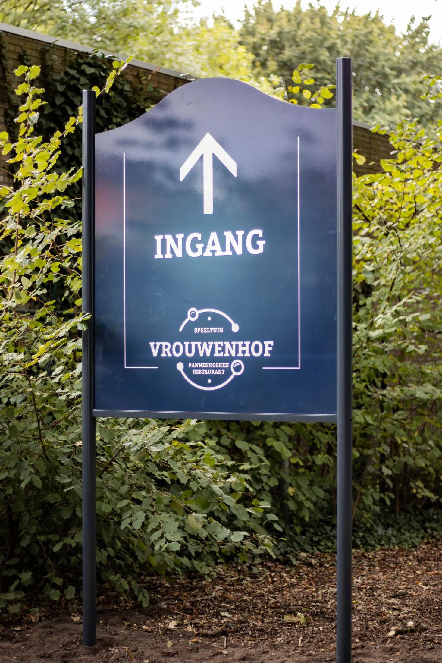
A welcome that points the way
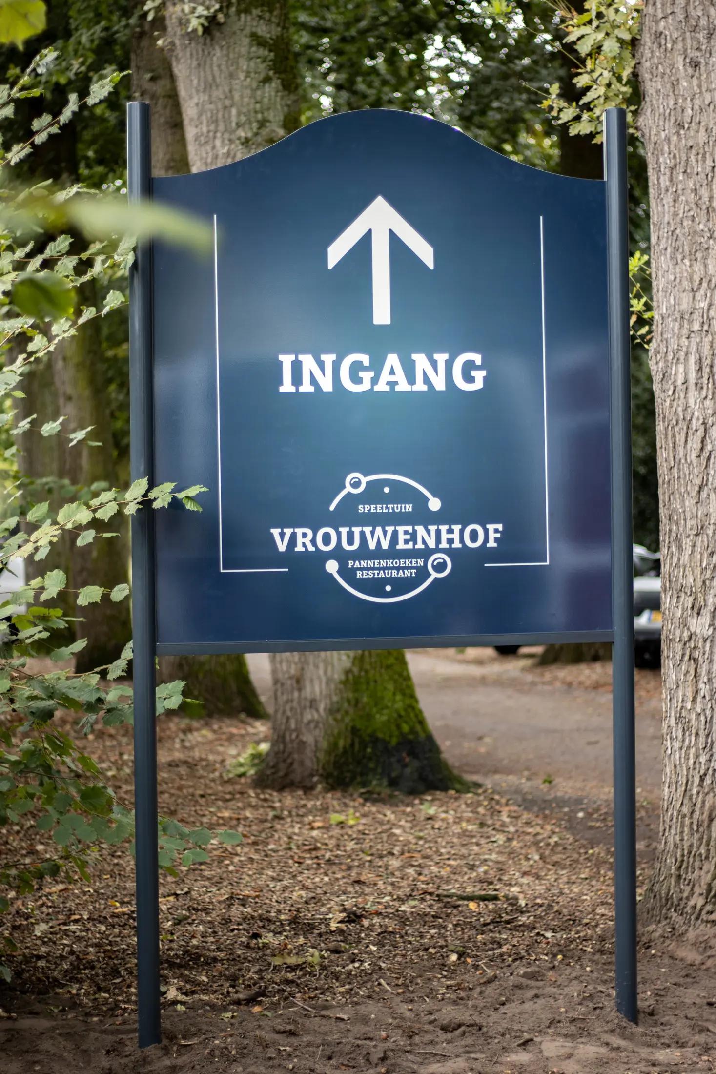
A visit to Vrouwenhof in Roosendaal starts at the entrance. From there, visitors need to find the playground, pancake restaurant or toilets with ease. Entrance signs, a directional signpost and information panels were brought together in one recognisable style for this location.
The dark blue, white lettering and distinctive framing reflect the Vrouwenhof identity. The shaped entrance sign also gives the welcome point a character of its own. The wayfinding serves a practical purpose while becoming a visible part of the venue.
Different destinations, one clear system
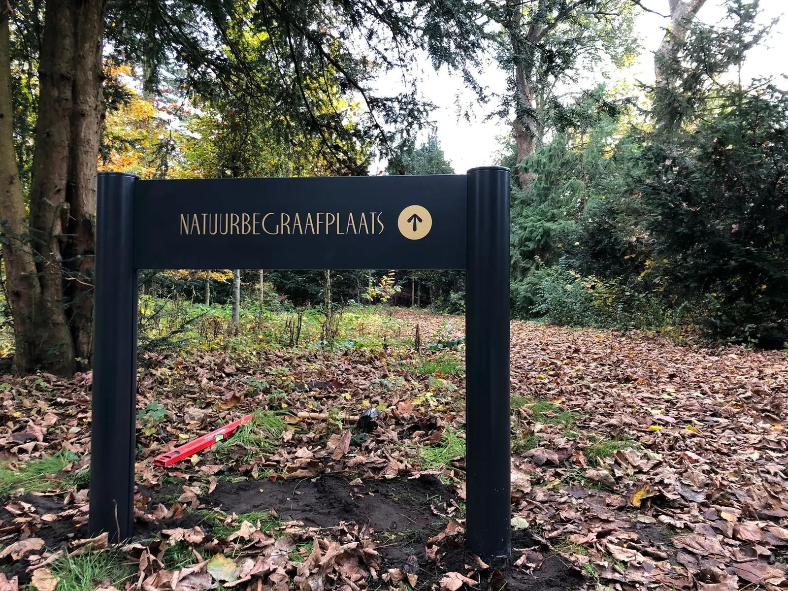
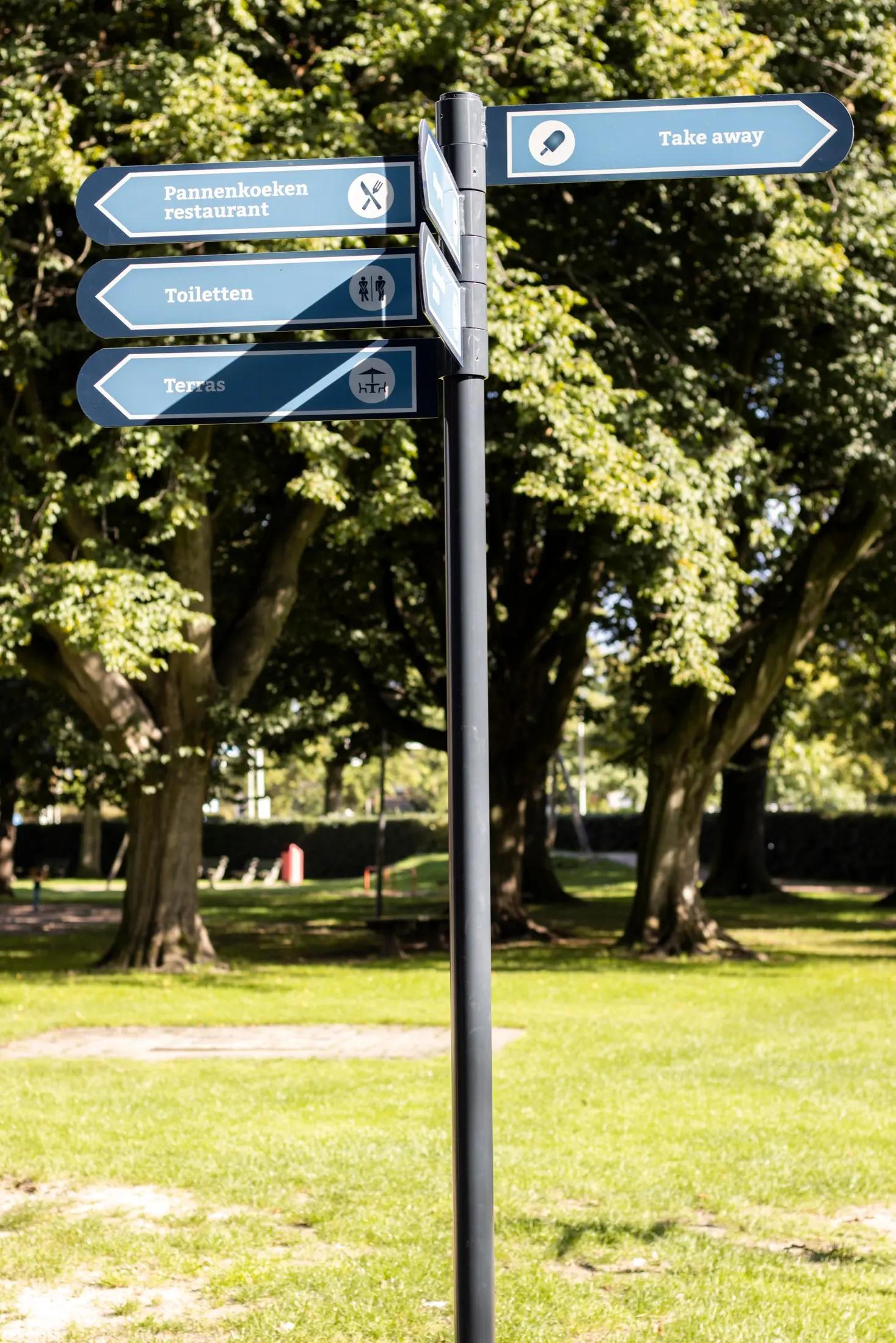
The signpost brings several destinations together in one place. Each direction has a separate panel with a short description and, where appropriate, a pictogram. This keeps the information easy to follow when visitors need to choose their route.
Positioning matters outdoors too. A readable sign needs to stand out amongst trees, play equipment and other features without dominating its surroundings. The freestanding installations give the signs a clear place in the landscape. The agreed anthracite post colour coordinates with the existing gate.
The practical value of separate directional panels
A system with individual directional panels allows information to be organised by destination. Shape, colour and lettering stay consistent while each arrow points its own way. This suits a site where visitors take different routes.
Panel dimensions, the number of directions and the connection to the posts all need to be considered together. The construction influences the appearance just as much as the artwork. The result is a compact arrangement that combines several directions and visually coordinates with the entrance signs.
Information where visitors need it
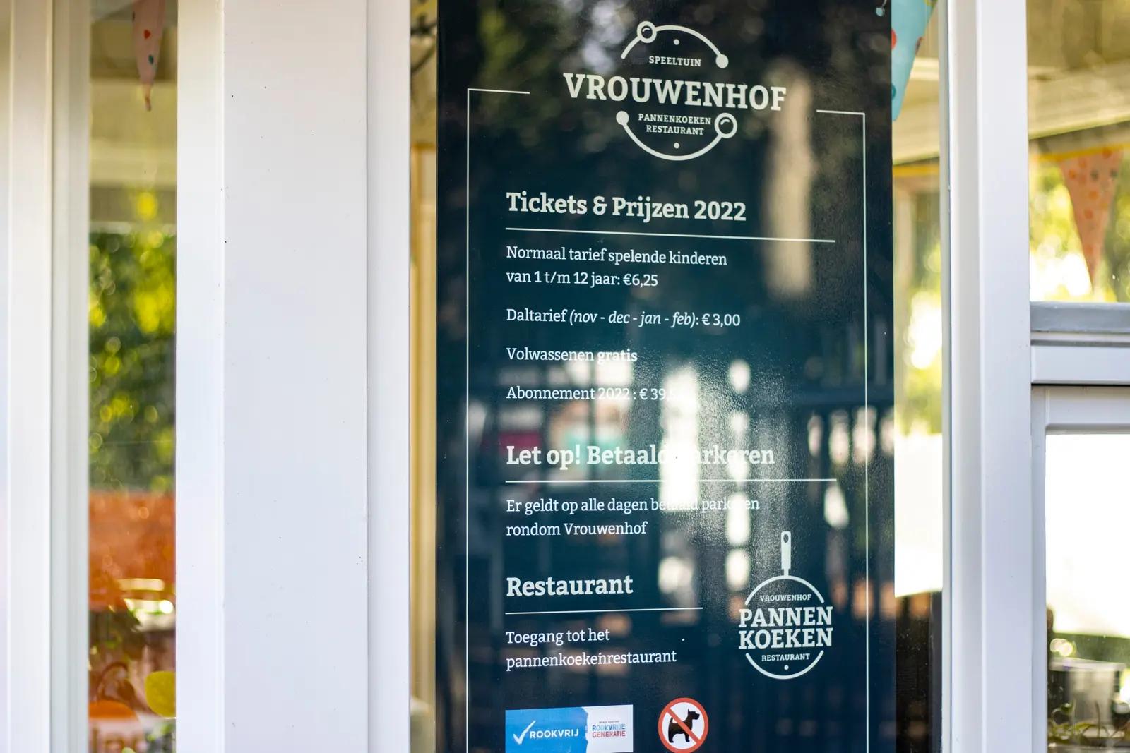
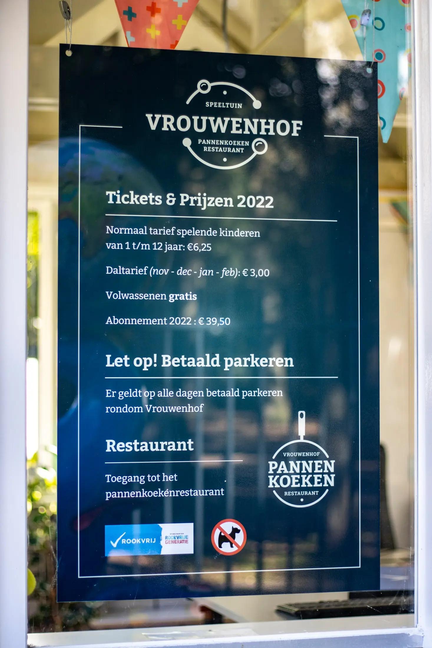
Alongside the route signs, visitor information was applied to glass. The white graphics are arranged to suit the window, bringing the logo and practical information together. This gives the logo and visitor information a consistent, recognisable place at the entrance.
Would clearer wayfinding help your grounds, park or hospitality venue? BlinkOut can advise on visitor routes, readability, visual identity and installation. From a recognisable entrance to the final direction, we help turn individual signs into a coherent system.
Your brand could be next
Ready to get your brand noticed?
Tell us what you have in mind. Taking inspiration from this project, we can help you find the right approach for your brand.